Premier Software, Web, and Mobile App Development Agency in Texas – Custom Solutions and Development Across All Platforms.
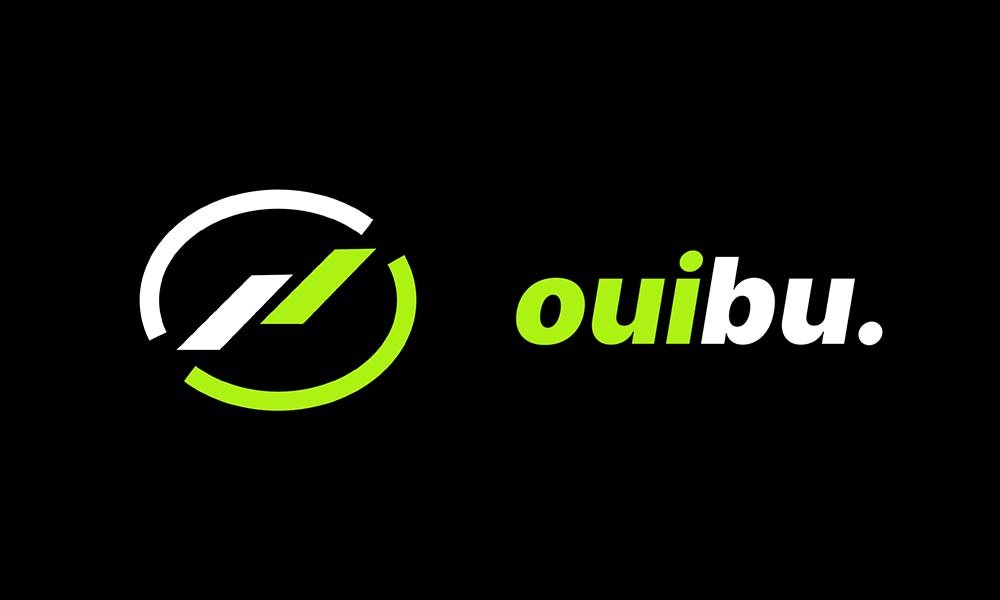
Ouibu - App Icon Design
A bold and futuristic app icon created for Ouibu, blending sharp motion lines with a high-contrast neon green and black color scheme. The icon enhances brand visibility on both light and dark themes, ensuring standout performance across app stores. This project showcases app icon design, brand identity, and UI/UX consistency—ideal for tech startups, modern apps, and digital product branding.
Design Process
1
Research 🔍
Identified the client’s requirements and target audience, ensuring alignment with brand goals and values.
2
Design ✏️
Created visual concepts, refined typography, and selected an appropriate color palette and layout.
3
Mockup 🧪
Developed realistic mockups to visualize the final output using tools like Adobe Photoshop.
4
Revisions 🔁
Incorporated feedback from the client and refined the designs accordingly.
5
Finalization ✅
Delivered all finalized files in required formats, ensuring print/web compatibility and quality.
Testimonial
"Highly recommend to everyone! I'm extremely happy with the results and the quick delivery time. The design exceeded my expectations and the whole process was smooth. Thank you so much for the great work! 👍🏼"
Ben441535
Tools Used
Project Gallery
Transform your vision into reality – let's create something amazing together.